When I acquired a Seeburg LPC-1 jukebox in 2001, the big empty space at the top bothered me: clearly there was supposed to be some lettering there. Once I picked up a manual, I saw I was correct, and it specified Seeburg Part No. 509072, the “Type ACK-2 Alphabet Case Kit.” I immediately set up some automatic notifications on eBay and waited.
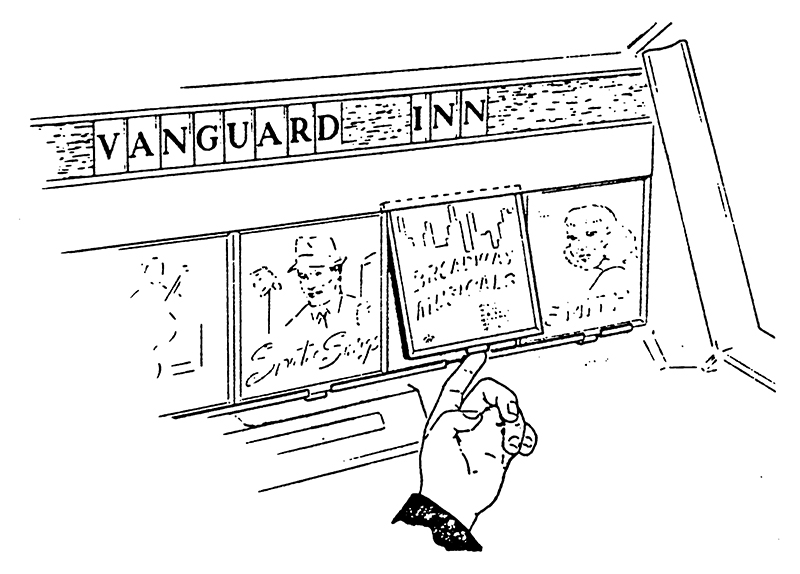
I was still waiting nineteen years later, as the 2020 pandemic was kicking in. Finally, I resolved to finally make a set myself. I looked at the manuals, examined photos and YouTube videos, carefully measured the header, and identified the typeface Seeburg used. I laid out a full alphabet with numbers and some extra characters and dingbats that I thought might be useful. Knowing what I know about design and printing, I reverse engineered how I imagined Seeburg had manufactured it in the sixties. Assuming that it was originally screen-printed, I knew digital printing would match the color and texture and be a lot more cost-effective for a small run. So I contacted a printer and had one set digitally printed on acetate. I cut it out by hand, which took a lot of time and patience, but it looked great!
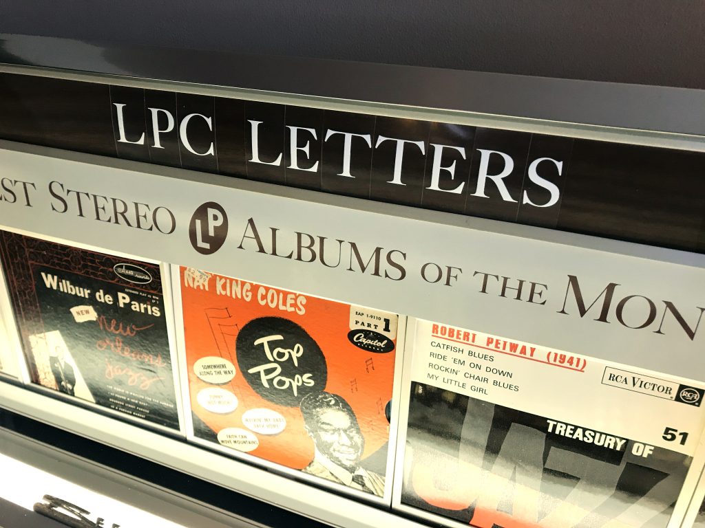
After I posted photos of this first set on Facebook, several other LPC-1 owners expressed interest in buying a set of their own. One forum member (Thanks, Michael!) wrote to let me know that that his LPC-480 used the same type, but in blue, and he had found one “S” in the bottom of his machine.
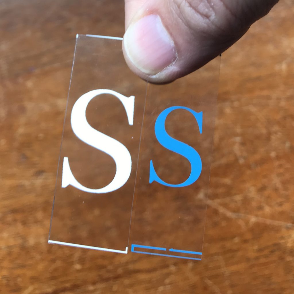
He mailed it to me for reference and I was delighted to see that my prototype set was VERY close to the original. my only miscalculation was the type size, mine were a bit larger than the originals (see photo above). It even turned out the method I used to mark the crop lines was nearly exactly the same way Seeburg had done it. So with a few adjustments, I made my first batch of lettering kits, both in white for the LPC-1 and blue for the LPC-480.
A couple months later, after I’d built a website and had sold several kits, one of my customers sent an ebay link to the auction I’d been dreaming of since 2001. A collector in Texas was selling a big set of lettering acquired from a retired Kansas jukebox technician. It even included some original packaging, and a large wooden storage box.
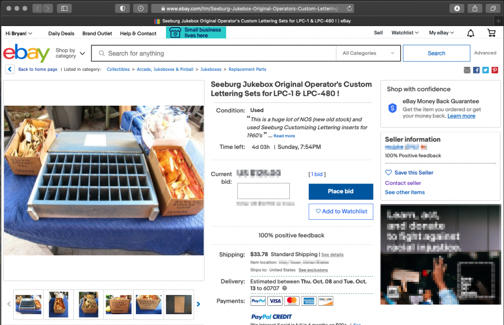
Hilariously, the seller had quoted my website in his listing, calling me “the expert” on this type of lettering, which is true in that no one else really cares about it, but I’m sure there are plenty of people out there with more firsthand knowledge (I’d love to hear from them!). I immediately contacted the seller, and he was happy to work out a deal with me, knowing I’d make good use of it. A week later a carefully-packed box arrived, and I excitedly dug in…
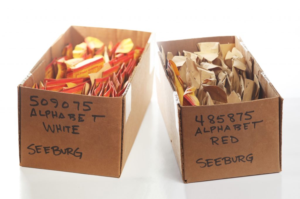
The bulk of the collection was two boxes labeled “509075 Alphabet White” which turned out to be the Seeburg LPC-1 type, and “485875 Alphabet Red,” the red block type I didn’t recognize. These letters were sorted into small envelopes containing 25 unused letters each.
Most of the white type (and some of the red type) was packed in custom Seeburg manila envelopes (judging by the part numbers, the red type was older, so probably sometime in the 60s, Seeburg started using the custom envelopes). I’d hoped there’d be at least one envelope for each character, but of course that wasn’t the case, there were several envelopes of some letters, and none of others.
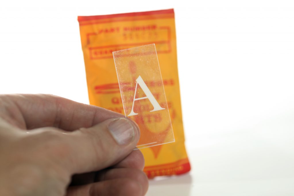
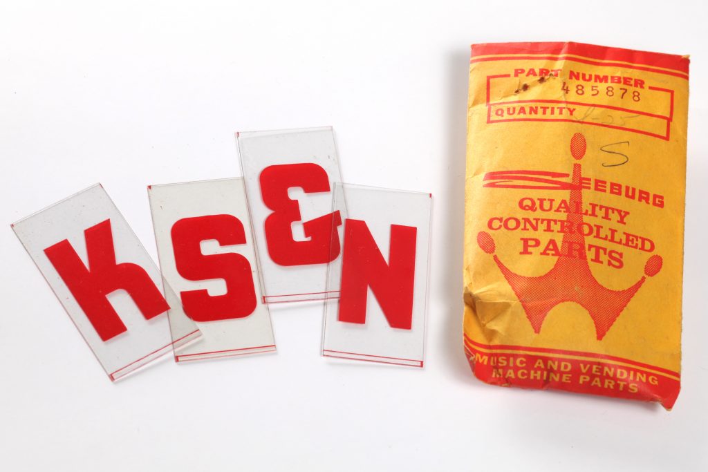
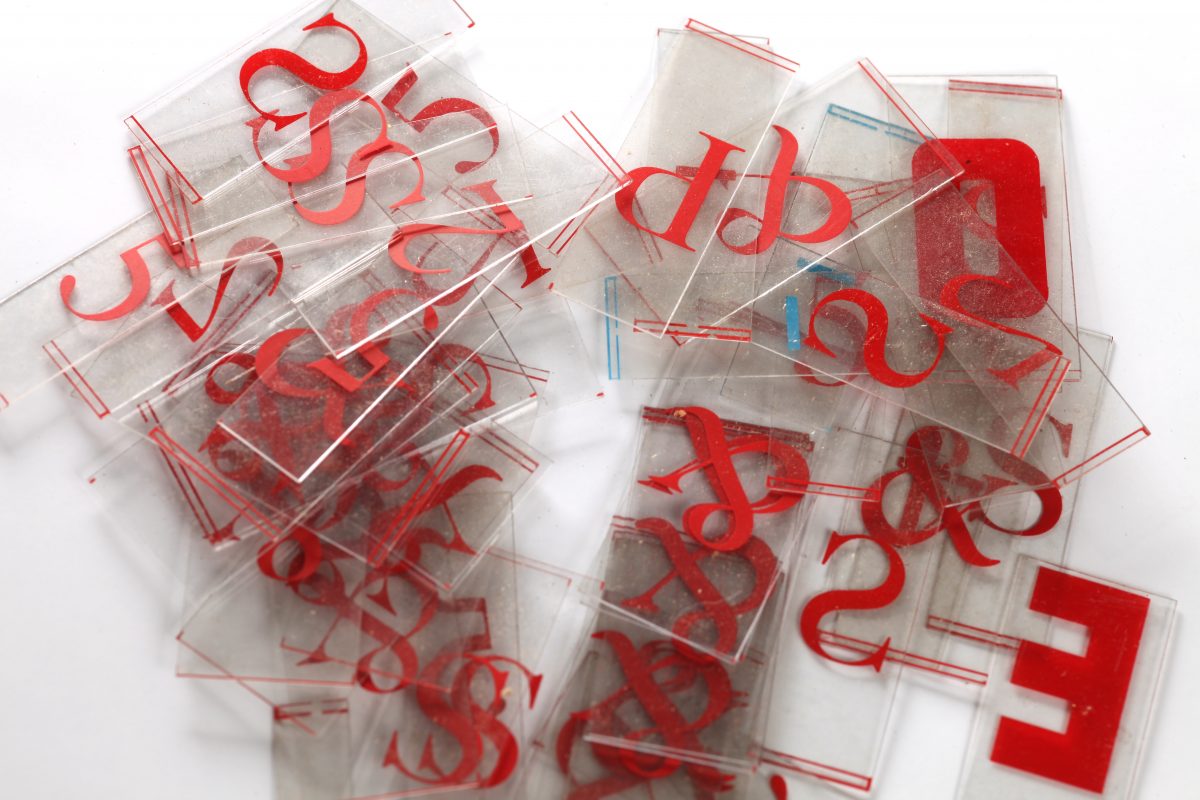
The red type was really neat-looking, and the tiles were the same size as the LPC lettering, but I had no idea what it was for. It was my guess (based on the typography and the part number) that it was for an older jukebox. Unlike the LPC lettering, it was printed in transparent ink, so I assumed it was backlit. I set it aside for the time being, and moved on to the third box.
The third box, about the same size as the first two, was not nearly as organized. This was all used type that had been salvaged from old machines. Some was organized into leftover direct-mail and Publishers Clearing House envelopes, but most of it was piles of loose letters. Along with white and blue LPC lettering, there was a lot of RED type in the “LPC” style. I’m still unsure what machine this was used for.

Some envelopes contained letters removed from jukeboxes in a specific venue. Some contained a giant mess of characters. One was labeled “C for Mr. Blue” and contained several blue LPC C’s that were smaller than the others. It took me a while to piece it together…
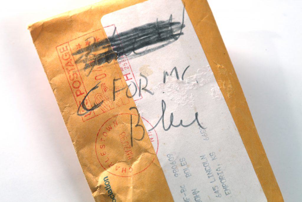
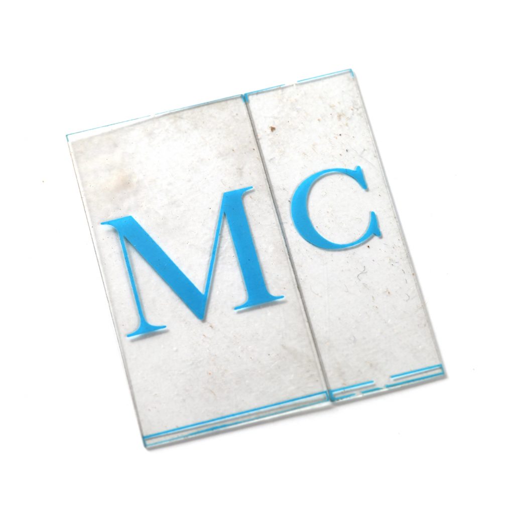
It didn’t say “Mr.,” it said “Mc.!” I guess the abundance of Irish-owned establishments warranted a special small-cap “c.” That was the only character I came across in this whole collection that I hadn’t been including in my sets! I made a note to add those to the next run.
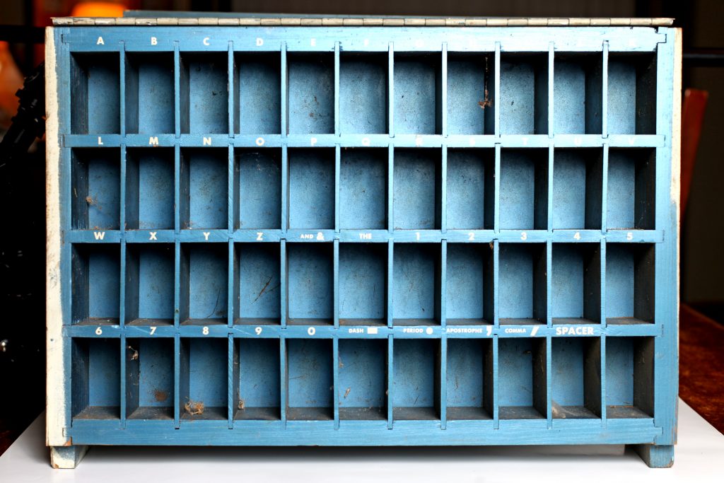
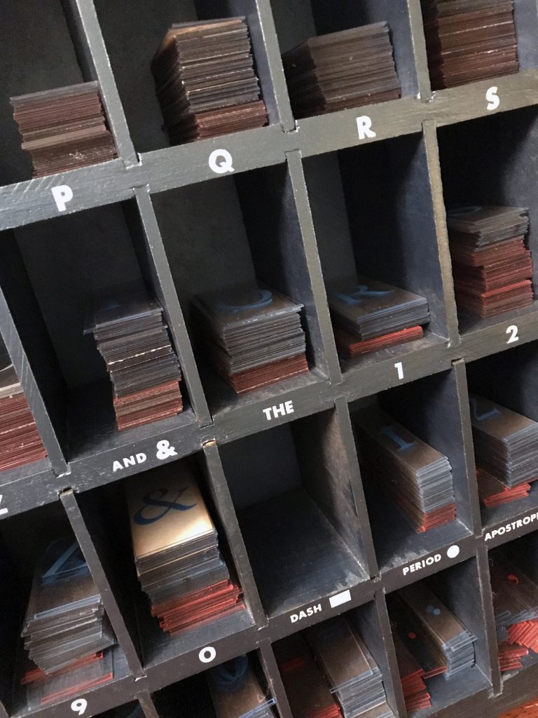
Finally, the storage box: It appears to be made specifically for this lettering, with each section carefully labeled, but it’s unclear if it was handmade by a distributor, or made and sold by Seeburg. It’s very well-engineerd, with a metal hinged lid that flips up. It’s angled back a bit, so the type stays in place when it’s mounted on a wall, which this one apparently was at some point. The outside of the lid and box was painted-over at some point, so I’m unsure of the original finish or if there were any markings on it, but the inside of the lid is unpainted blue-tinted anodized steel with a yellowed label glued in place:
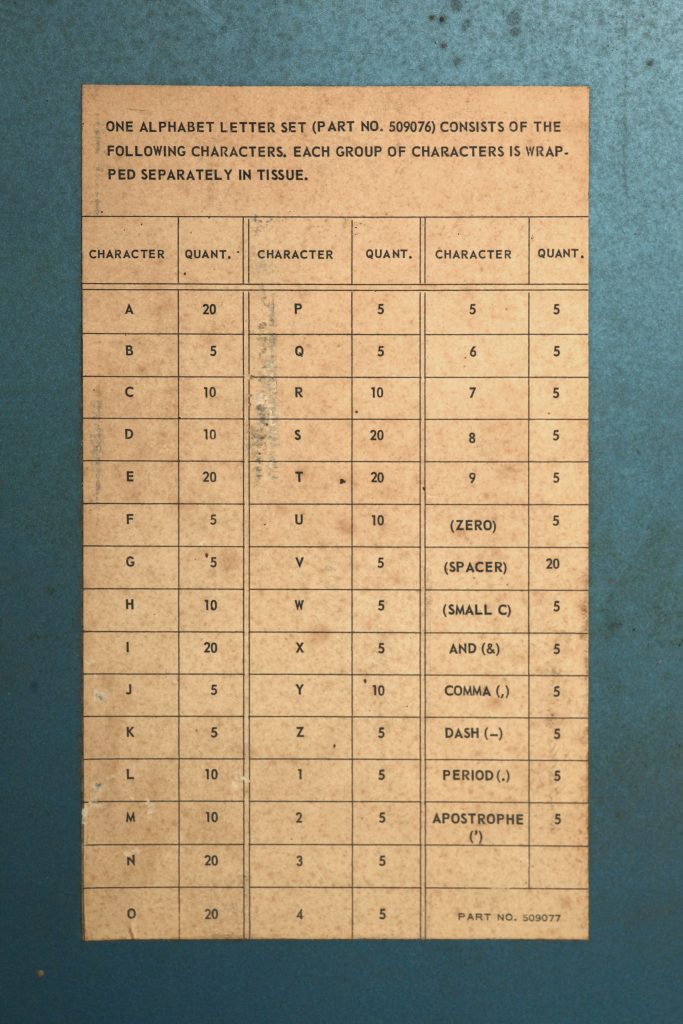
At first, this felt like the answer to all my questions, but with time, it’s only added more. Note that it cites part number 509076, and is marked as part number 509077 (close to the white LPC kit, “509072” and the SC-1 Consolette kit “50988”). The best I can figure, the “Alphabet Kits” listed in the manual were NOT for end-users (club owners) but for distributors, who would presumably buy this large storage box that included a starter set of lettering, and could be refilled as needed by ordering 25-pack envelopes. That makes sense, as the distributors would install the lettering when they installed or serviced jukeboxes on-site. It’s possible this storage case was for an entirely different Alphabet Kit, or perhaps that part number is for the box itself, which could be used to store any Alphabet Kit. And, again, it’s even possible that the box was home-made and the label was just a sheet of paper that was glued into it. If anyone out there has a comprehensive Seeburg parts listing, I’d love to see it.
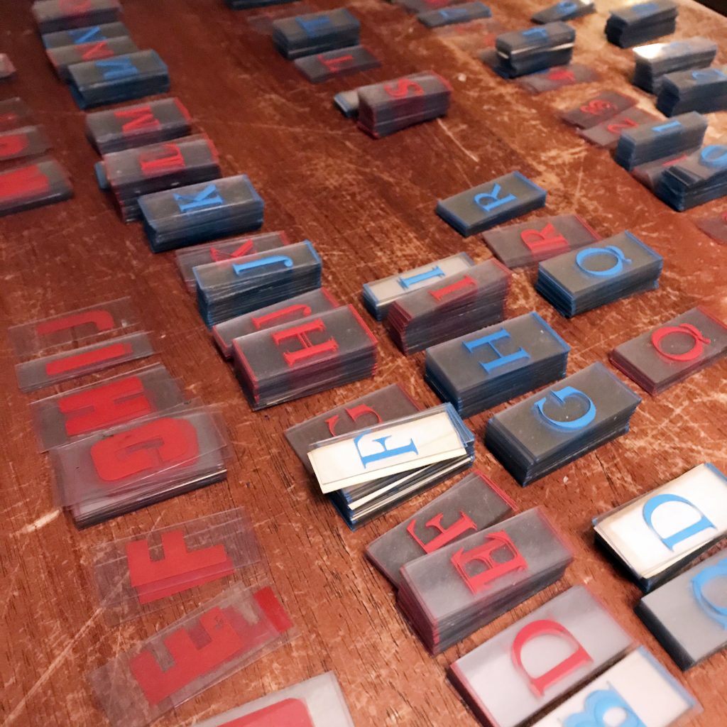
All in all, after my son and I spent a full evening cleaning and sorting the type, there were a few thousand letters and numbers and punctuation marks, but not a complete set of any of the LPC colors, ha. In any case, it gave me a good idea how the lettering was made, packaged, and distributed, and I did find at least ONE example of each character (as far as I can tell, numbers weren’t made) of the block red alphabet.
Oh! Almost forgot, I spent days trying to figure out what that block text was for, and eventually I tracked it back to the earlier (I was right!) Seeburg AY-series jukeboxes. But looking at photos, I couldn’t figure out where it was used. Then I found a PDF of an old sales brochure, and saw that the “Seeburg” logo at the top could be removed and replaced with the lettering!
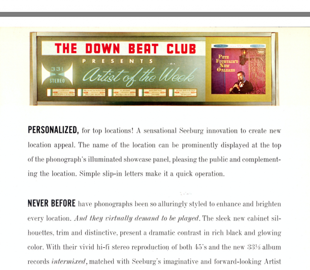
So I’ve spent the last couple months redrawing the type in my spare time, and that will be available soon for AY owners!
The main mystery that remains is what the red LPC-style type is (it occurs to me just now that maybe that is part 509076?). There are a lot of jukeboxes built around that same platform in the mid-to-late sixties, I suspect the Stereo Showcase, Discotheque, Electra, or Phono-Jet, hopefully a customer or someone else who comes across this story will point me in the right direction!
Hopefully this journey was as exciting for you as it was for me! I know 60s Seeburg reproduction jukebox lettering is a very small market that’s never going to make me rich (if I sell another several kits, it might cover the printing, and what I paid for this auction!), but this project gave me something to focus on and helped keep the Covid-19 blues at bay. It’s all been worth it to hear from a handful of happy customers that have been looking for these lettering kits for years.

You must be logged in to post a comment.