
(Each model is listed individually, before starting work, be sure to read the general tips about safety, alignment and spacing at the bottom of the page.)
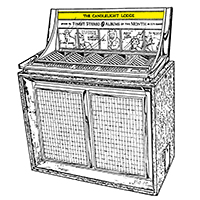
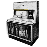
Seeburg LPC-1
Read Seeburg’s LPC-1 original instructions
Unlock and lift the top glass and secure it with the safety bar. The LPC-1 has a wood-grain header panel with aluminum channels for the lettering. This whole panel can be snapped out of the machine. The two snaps are behind the two rivets visible on the panel. Just hold the panel near the rivets (not from the center!) and pry it off. Use care not to scratch the mirror finish on the interior side panels! Then set the panel down on a table (notched end up) and get to work. To reattach the panel, line it up carefully then press firmly on the rivets to snap it back in place.
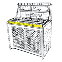
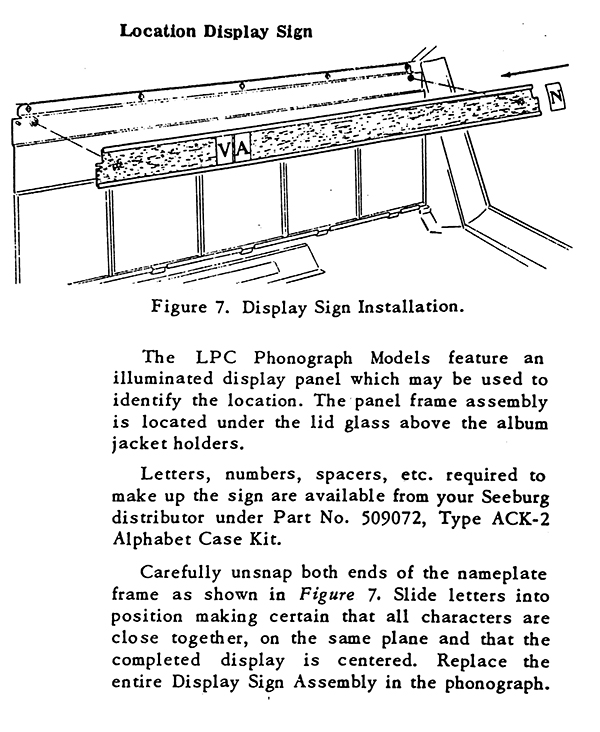
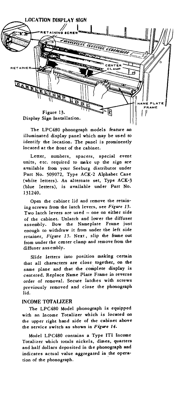
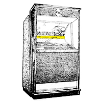
Seeburg LPC-480
Read Seeburg’s LPC-480 original instructions
Open and secure the top glass and remove the retaining screws from the latch levers on either side of the cabinet. Then you can unlatch the “diffuser assembly” (the backlit panel where the lettering goes) and tilt it towards you. There’s a plastic nameplate frame held by retaining clips, carefully remove that, slide or flex the letters into position, and reassemble it all.
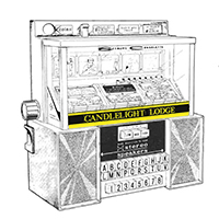
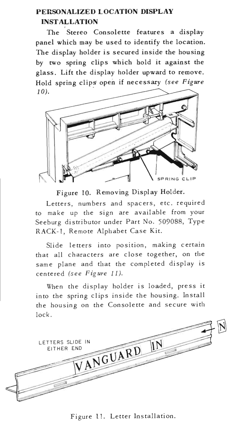
Seeburg SC-1 Consolette
Read Seeburg’s SC-1 Consolette original instructions
A plastic display panel is held in place inside the front housing by two spring clips, use the tab on the pack of the panel to lift it upwards out of the clips.
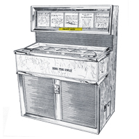
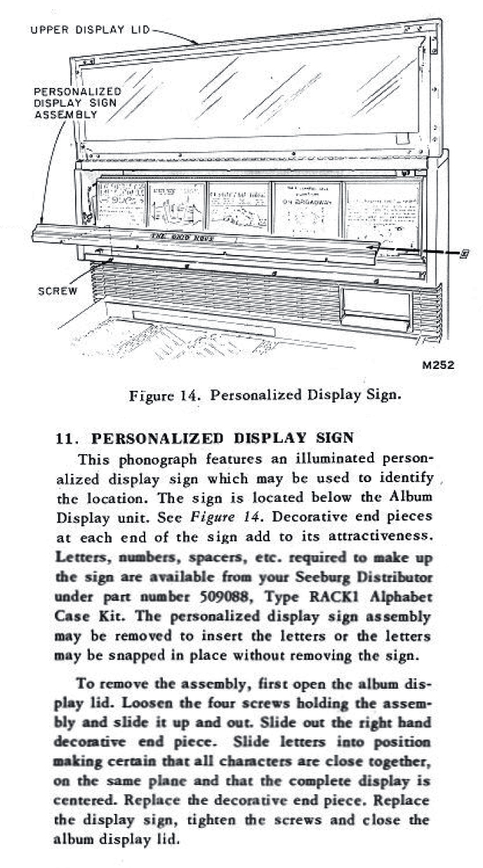
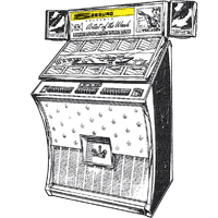
Seeburg Stereo Showcase 160
Read Seeburg’s Stereo Showcase 160 original instructions
Letters can be placed in the plastic display assembly under the Album Display unit. The display assembly can be removed by loosening (not removing) the four screws below it, but it’s probably easier to simply flex the letters into the display in place, which also saves you having to remove/replace the (likely brittle) decorative panels to the sides of the space for type.
Seeburg LS1 Spectra
RACK-1 Letters are placed in the plastic display assembly above the Album Display. We don’t have the manual with instructions for this model, but it appears reasonably straightforward. If you do have a Seeburg LS1 manual, we’d love to see/share the specific instructions!
Seeburg U100 Mustang
and Discotheque Jr.
ACK-2 Letters are placed in the assembly above the title strip display. We don’t have the manual with specific instructions for this model, but it appears to be similar to the design of the LPC-1 panel. If you do have a Seeburg U100 manual, we’d love to see/share the specific instructions!
Seeburg AY100, AY160, DS100, DS160
Read Seeburg’s DS100/160 original installation instructions.
AY large red block letters are placed in a header strip in the top of the jukebox. The header can be removed by unscrewing the center screw that originally retained the shipping tag, then unsnapping two snaps, one on each side of the top of the header.
General Tips and Tricks
Safety measures
Before inserting letters, it’s best to turn off and unplug the jukebox. If the top glass must be lifted, use the safety bar as instructed in the manual to secure it in place while you’re working. Use care to avoid scratching the letters or any interior surfaces of the jukebox. Spread a towel below the display section to prevent letters or hardware falling into the mechanism, or through cracks in the case.
Slide or flex?
Seeburg recommends sliding the letters from the sides. This works fine, but since our reproductions are a bit more flexible than the originals you may find it easier to simply flex the tile a bit and tuck it right into place. (Original letters are more brittle with age, so you might want to stick to sliding them in, to avoid risking breakage.)
Centering your letters:
Once you have the panel/tray out, measure and mark its center point with a pencil or a piece of tape on the top edge (where it can be erased, or will be hidden when it’s reassembled). Lay out your desired text, spaced as desired, on the table under the panel and use a ruler to find the center of the text (note that all letters are not the same width!)
Insert that “center letter” below your center mark. Then continue adding the rest of the letters, outward from the center. Easy peasy. When you’re finished, double check your spelling and type alignment before returning the tray to the jukebox.
Fine-tuning your letters:
By nature, this system was a little janky and rest assured your jukebox probably looks better than most did back in the day. But if you want to get persnickety, here are some tips:
- Each tile, like the originals, has a stripe along the bottom edge, so be sure to keep that side down. It will be hidden by the channel once in place. An upside down “S,” or an upside-down “W” instead of an “M” looks fine to most suckers, but your graphic designer friends will flat-out lose their minds if they see that.
- Ditto for flipped letters. “A” and “U” and “M” look vertically symmetrical, but they’re not, and they’ll look goofy if flipped. The letters have an obvious “ink” side when you look closely, that side should face out.
- By the nature of modular lettering, some letter pairs just don’t match up neatly. “A-V” is going to have a bigger gap than “H-P.” Computers fix that spacing (“kerning”)‚ so we’re all spoiled now. Rest assured that your slightly-wonky spacing looks just like it did at The Candlelight Lodge back in ’63. On top of that, letters from different batches can vary a little. If you buy a complete set, they should line up neatly, but even OEM examples are wildly uneven from batch to batch. If it bugs you, try giving adding a little extra space between each letter. Or spread them way-the-hell-out (they did it that way in some product photos anyway, probably for the same reason). You could trim bits of acetate away with a utility knife for better kerning, but only a severely anal-retentive typography nerd would do that (yes, I’ve done that!).
You must be logged in to post a comment.